(Failing to) Find the Olympic Flame Online

Yesterday, I went out on Rue St-Denis to see the Olympic Flame pass by for the second time in my life, and I hope to see it again at some point. I also hope that next time it will be much easier to find out where to go to find the flame.

The 106-day torch relay for the 2010 Olympic games in Vancouver is a big deal here in Canada. It is on the news every day and is travelling 45,000 kilometres making a great loop around the country. Right now, with the games approaching but not right on our doorstep, the torch relay is the most important part of the olympics to me, probably to many Canadians. However, when I went looking on vancouver2010.com to see where I could find the torch I was thoroughly confused. It is easy to find out about every sport that will be played in 63 days time, but learn about the torch relay happening right now I had to dive deep into a pop-down menu, then take a guess at which icon would lead me to a map or description of the torch route.

These are the choices I had:

Which icon gets us to a map of the torch route?

And this is the right choice:

Apparently this means "Map"

The map should have been simple to read, after all, it’s a map with a route drawn on it. Just zoom in to see what’s going on near you. Well, good luck, when you zoom in too much the route disappears! It turns out that you have to choose your “community” then you can see a detailed map of what’s happening in that community. I’m not sure why this is, and it’s quite confusing. Once you’ve got your community selected, you may have to select different routes in your community, (the relay is less like a relay around the country and more like a travelling roadshow with some stops where people get out and run than I had thought), and you can see what time the flame will be in different places, in the HTC timezone, whatever that is.

I hear the games are over budget, but it would be a wise investment to put a direct link on the vancouver2010.com homepage to the map. There are lots of links to videos of previous days, and in truth they do sometimes link the Latest News block on the page to the map, but for me, when I went to the site, I was looking for a more permanent link to the torch relay information. After all, the torch relay is on for 6 times as many days as the games themselves.

I was lucky, I found where the torch would be, and was there at the right time, (for me HTC was Eastern Standard Time, but I don’t know if it is everywhere, maybe it just means Local Time). I hope everyone else who is looking for the map can find it.

In case you’re having trouble, here’s a link to the map.

And here is the torch, (I didn’t have a camera with me, so this is from Flickr:
The Torch in Montreal

down2night

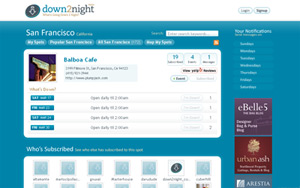
Screenshot of a listing on down2night

Earlier in the week I received an E-mail, (through this website), asking me to review a service called down2night, so here goes.

With the tagline “What’s Going Down 2 Night?” down2night.com seems at like a pretty cool service. Users sign up, provide a cellphone number, and on certain nights of the week, (chosen by the users), they get text messages telling them what’s “going down” that night at their favourite places. While there are only three cities covered by the service right now, (San Francisco, Seattle, and the Tri-Cities area, in Washington), they are expanding, (Los Angeles is next and Las Vegas is coming).

What I like:

I like the design of the website, it looks slick. If you follow one of the obvious navigation paths it’s easy to get around. You can browse venues and events in cities as well as leave comments about those venues. There are also reviews provided by Yelp.com. You can see who else subscribes to each venue and what they like, something that is handy if you want to find similar places to that great watering hole you were at last night. The interface is all AJAX-y and cool as well.

The best feature of the site is the SMS messaging. Once you’re set up you don’t have to think to use the service. When your favourite party night, or nights, roll around a text message will be sent to your phone telling you what’s going down at your favourite destinations. Simple and easy, and you don’t have to be near a computer or an internet connection for it to work.

There are a couple of really great things I noticed. When selecting your wireless provider I was pleased to see that the major Canadian providers were on the list, (although it doesn’t look like the service will be covering Canadian cities anytime soon). Also, the site seems to work in Opera with no problems at all. Since Firefox 2 came out I’ve been using Opera more and more and it’s nice to not have to switch browsers to do some testing.

What I don’t like:

Despite all the good things they’ve got going on there a few things that down2night could be doing better. I took a quick look at the HTML source of a couple of the pages and it is real XHTML. However an inline style attribute for a background image seemed out of place and I would really like to see down2night make use of microformats. This is a perfect application for the hCard, hCalendar, and hReview microformats and they didn’t take the opportunity. Hopefully they will as the service and website develop.

From a trust standpoint I was not able to find any physical contact information. Not even a post office box. This is something I would like to see before handing over any private data, such as my cell phone number. Also, I wasn’t able to sign up for the service without entering my cell phone number. Since my wireless provider charges me for receiving messages originating from web services, (and I wasn’t really sure who I was giving my number to), I didn’t sign up. Had the phone number been optional I would have completed the sign-up, looked around, and caused some more advertising impressions. An E-mail notification option that can be used either instead of, or in addition to, the SMS notifications would make sense.

I am concerned about their ability to make money. There are very few advertisements on the website and no subscription-based revenue model. I think if they offer an E-mail notification option that drives traffic back to the website it will help with advertising revenues. Also, there are opportunities to charge for premium placement of venues and events.

The final thing I noticed is an apostrophe error. On the about page they wrote “your” when they meant “you’re.” This is a little ironic since someone from their team had to actually come to my site, which contains an article on the correct usage of the apostrophe, to send me the the request to review down2night.

In the end:

down2night looks like a great service that is expanding. They seem to be working at improving and promoting their service, and hopefully as the service improves it will reach its full potential. If only they would put some sort of physical address on their website I think people will be more comfortable signing up for an account. Oh, and one more thing: proofread.

Cork’d

One night you feel like a bottle of wine. You want something with a bold flavour, but not too spicy, and the name of that perfect wine you had last fall is escaping you. Enter Cork’d.

Cork’d is a freshly launched sort of social search or social networking site for wines. You can compare tasting notes, keep track of your wine cellar, keep a wishlist, and even find some drinking buddies, (hopefully some close by!). I just signed up – it’ll be fun. Check out my massive wine cellar.

From a technical and design point of view Cork’d has enough AJAX-y goodness to be really efficient, but not so much you have to learn to use the web all over again and great user interface. The colours are reminiscent of wine, cork, and comfort, all the things that wine stands for. All in all, well done.

All that remains now is for those who enjoy wine to head on over and join the community.

Revisiting Windows Live Mail

Almost 20 days ago I wrote about Windows Live, including Windows Live Mail. After twenty days of using Windows Live Messenger and Windows Live Mail betas I am back to say a little more – especially about mail.

Windows Live Messenger is actually growing on me. I like it more and more. My favourite new feature is the ability to send offline messages, (although Microsoft is a little slow on offering this feature, ICQ had it in 1996). It’s something that’s really been missing from MSN Messenger. Other than that, no new opinions.

As for Windows Live Mail, the opposite is happening. I am liking it less and less. I am finding it incredibly slow. On March 4 I said it was faster than the old Hotmail but this is no longer the case. Maybe it’s not actually Windows Live Mail though, maybe it’s because I have to switch to IE to see my mail, or maybe it’s because more people are using Windows Live. Either way it has to speed up.
This brings me to my other point. Twenty days later and still no sign of Firefox support! Sometime soon I’d like to not have to have another browser open just to check my E-mail.

The third and final point after Twenty days of use: The advertising space at the top of the page is too big. I know that they have to make money on this product, and that it’s probably the same size as it was in Hotmail, but it seems too big. I think we notice the lack of space because of the addition of the preview pane, (which is great!), and because of the lack of speed. If messages loaded quickly in the preview pane it wouldn’t be a big deal, but when we have to wait forever to scroll it’s another story.
All in all, Windows Live Mail still has great features and shows tons of promise, but the speed needs to pick up and I need to be able to use it in browsers other than Internet Explorer. I’ll continue using Windows Live Mail through the beta period, (now I’m in it’s kind of my duty), and once it’s complete we’ll see what I want to do.