Apostrophes are often misused, as I noticed over the past few years. So, I am writing on the proper use of the apostrophe and the logic behind its rules.
Apostrophes only have two uses: to indicate that something has been taken out of the word, (or words), written, and to indicate a word is possessive when used with an “s.” Apostrophes are not used to pluralize words. To tell the truth, there is only the first usage, but this requires a history lesson which I’ll get to later.
Contractions
Contractions are the result of replacing letters or spaces with apostrophes, (this is the first use: indicating something has been taken out). For example, when “can not” becomes “can’t” the space and letters “n” and “o” are replaced by an apostrophe. Similarly, when “she is” becomes “she’s” the space and letter “i” are replaced by an apostrophe. Of course, it also works on proper nouns. For example, in “John’s going to the market” “John is” has been shortened to “John’s.” Incidentally, “John’s” is the same spelling and pronunciation as the possessive form of “John,” but not the plural form.
Possessive not Plural
Now for the history lesson. Once, a long, long time ago, a word made possessive was indicated by adding the letters “es” to the end of a word. For example, the sentence “Johnes house is big,” meant that my house is big. Over time, an apostrophe replaced the letter “e” and as a result, words are now usually made possessive by adding an apostrophe “s” to them. In modern English the sentence above reads “John’s house is big.”
Since a plural is generally indicated by adding a single “s” to the end of a word there is no “e,” or anything else for that matter. So, to pluralize, an apostrophe is never used. For this reason sentences like “Banana’s are on sale” or “Let the dog’s out” are incorrect.
Its, It’s, Your and You’re
The word “it” and its possessive can be quite confusing. It seems like the possessive should be written “it’s” but this is not the case. The reason is that “it” was invented after we had started using apostrophes to indicate possessive words, so there was never an “e” to replace. For this reason “it” has its own special possessive form similar to “his,” “your” and “yours,” and “her” and “hers.” The possessive form of “it” is “its.” Because the possessive form of “it” is “its,” the only time an apostrophe should ever be used with the word “it” is when writing a contraction such as “it’s sunny out” for “it is sunny out.”
“Your” and “you’re” also can be confusing because they both sound the same. The possessive of “you” is “your” but “you’re” is the contraction of “you are.” So, “your coat is dirty” is correct, but “you’re coat is dirty” is not; this is because it means “you are coat is dirty.”
Slang and Accents
Sometimes an apostrophe is used to help write slang or accents. In this case, as above, an apostrophe is used to replace missing letters and spaces. Some examples are “y’all” and “ma’am,” which if written out would be “you all” and “madam.” Using apostrophes to write slang and accents isn’t very common, and is only needed in a very few specialized circumstances.
Conclusion
To sum up, all you have to remember is to never use an apostrophe when writing a plural. Keep it for contractions and possessives. If you are confused about whether or not to write “its” or “it’s,” remember that the only reason to use an apostrophe with “it” is for a contraction – so if “it is” doesn’t fit “it’s” doesn’t either. The same rule applies to “your” and “you’re.” If “you are” is wrong so is “you’re.” So long for now, and happy writing!


 Over the weekend I took a little trip to Toronto and Niagara Falls. To get there I rented a car, (pictured right, it was cheaper than the train). The photos aren’t that great, I forgot my camera so had to make do with my phone. After reserving the smallest car possible online with
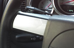
  The first thing that I noticed when I started to drive was that there is an extra lever on the left side of the steering wheel where I only expect to find the turning signal control, (pictured left). This is the cruise control and is quite annoying until you get used to it. I couldn’t see either of the two levers while driving and don’t feel I should have to look down to signal, and every time I tried to turn I would try to signal with the cruise control. When driving on the highway it was handy to have the cruise in such an accessable place but I suspect most people will spend much more time in the city than on the highway and will want the cruise put somewhere else.
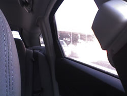
 When trying to do a shoulder check on the driver’s side of the car I found my view was mostly of pillars and I didn’t see much road, (pictured right). Visibility in general in the Magnum is not as great as it could be, however, this is a large car and with larger vehicles come larger blindspots.